Composition - 123
- Primary, Secondary, and Tertiary Shapes
- Big, Medium, Small
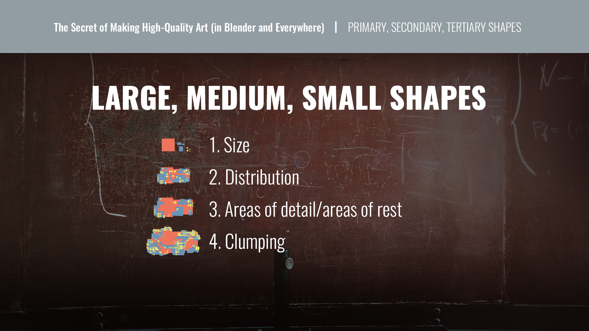
- Large, Medium, Small
- 1st Read, 2nd Read, 3rd Read
- Layer 1, Layer 2, Layer 3
-
BG, middle person, small stuff
-
Largest,Support shapes(primary shapes),Another level below,super tiny detail.
Sometimes, 3 reads aren’t enough. In this example, I split it one step further with 1st read being the largest shapes, 2nd is more support shapes that make up the primary shapes, 3rd is another level below that, and 4th read shapes are the super tiny detail.
https://www.creativeshrimp.com/the-secret-of-high-quality-art.html
So basically, the primary shapes will define the silhouette and the secondary shapes will define the individuality of the character or object and the tertiary shapes will define the emotion or the story.
Uniform pattern are boring not because they are predictable, but because they are unnatural. Nature is chaotic not regular. So a regular pattern looks fake. Even in human hand made environment, patterns are chaotic because city, house, building, car do have a life, and thus all shaped and look different.
Contrasts In Composition
Part 1 : Contrast To Create Visual Interest
- Contrast In Value
- Contrast in Color
- Contrast in Size
- Contrast in Pattern (Order)
-
Contrast in Position (Space)
- This creates areas of detail and areas of visual rest. To learn more about this principal, visit my lesson in Areas Of Visual Detail, Areas Of Visual Rest.
-
Contrast In Hue/Saturation
- Contrast In Shape
- Contrast In Edge Quality
Part 2: Contrast To Create Emphasis Or A Focal Point
- Contrast In Value
- Contrast in Color
- Contrast in Size
- Contrast in Pattern (Order)
- Contrast in Position (Space)
- This creates areas of detail and areas of visual rest. To learn more about this principal, visit my lesson in Areas Of Visual Detail, Areas Of Visual Rest.
- Contrast In Hue/Saturation
- Contrast In Shape
- Contrast In Edge Quality